OPPORTUNITY
Revolutionising banking for the next-gen
Traditional banking is cold and intimidating, bound by complex jargon and fine print. For millennials who are just about to start their financial journey, this is a complete turn-off.
Thus, OCBC launched FRANK by OCBC — a sub-brand that aimed to revolutionise banking and connect with younger customers.
SOLUTION
A new face for Singapore’s first youth bank
The brief was to brand FRANK by OCBC as the coolest bank Gen Y has ever seen. A tall order — but not impossible.
As the first-of-its-kind youth bank in Singapore, FRANK was clear of the impression it wanted to make: a hip, stylish and trendy brand dripping with obvious youth appeal.
With that in mind, we created an identity that not only sets the tone of the brand and gave it a distinct voice and personality, but also one that makes a strong mark with its visual presence.
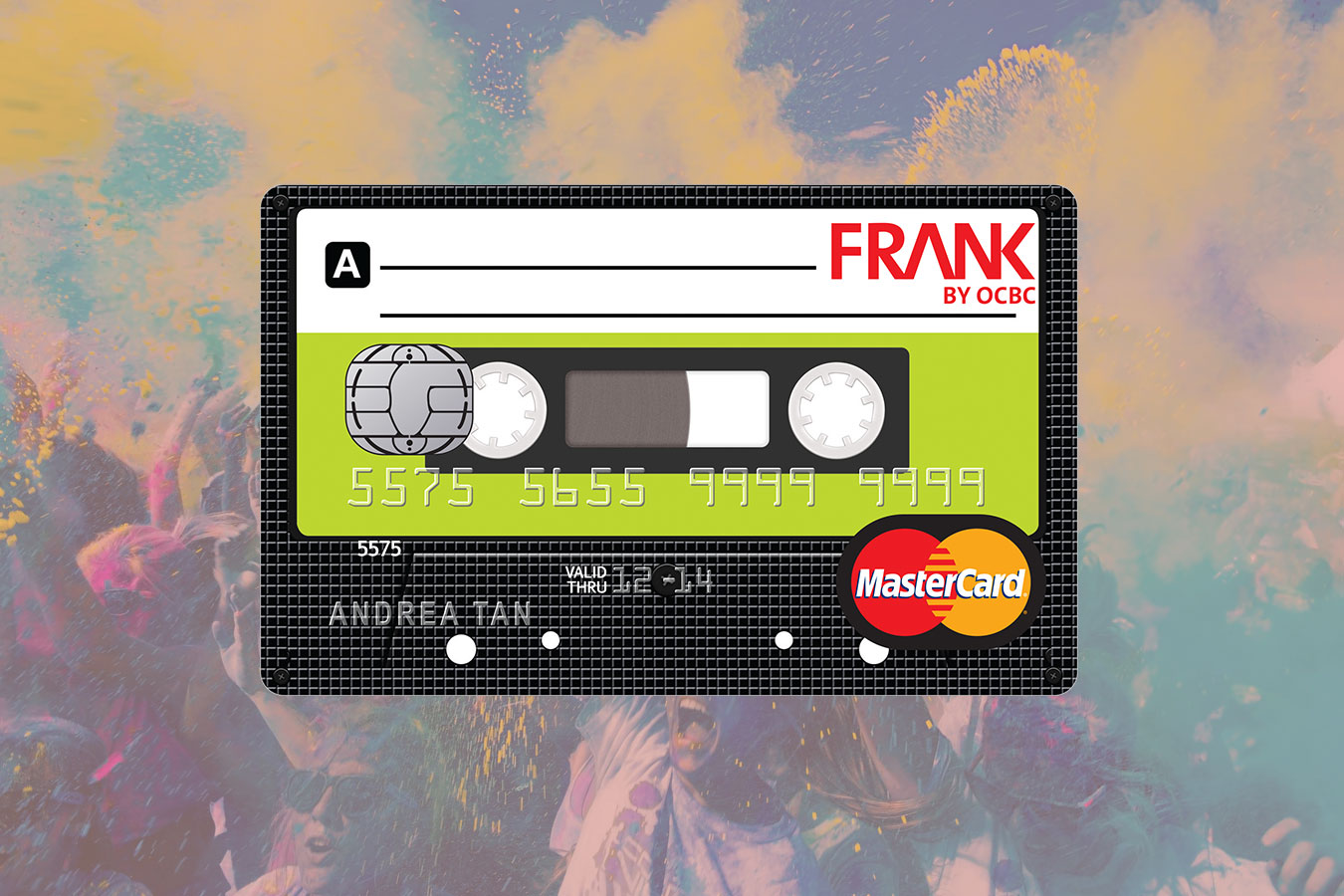
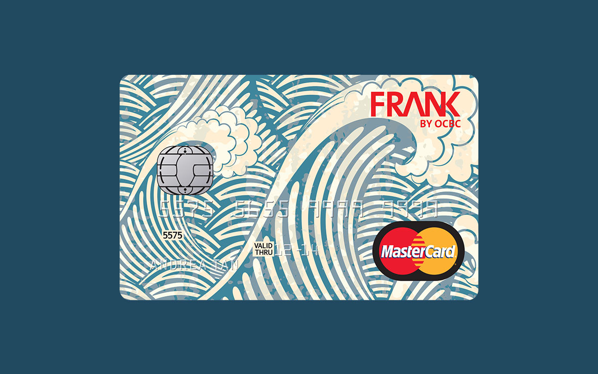
Think snazzy new logo. Hundreds of unique card designs. Creative merchandising. An explosive entrance on social media. Everything that makes banking exciting and desirable for millennials.



RESULTS
Top 10 Best Banking Brands To Watch
“It’s fun and refreshing watching OCBC expand from such a strong foundation.”
– The Financial Brand
Read more here.
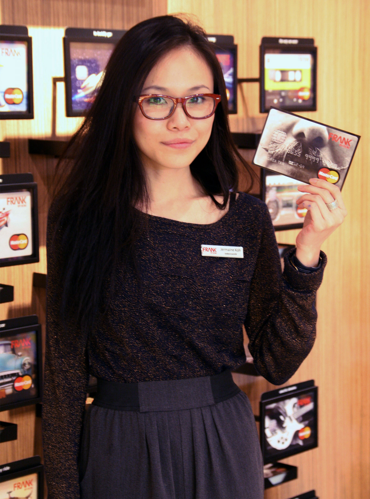
Image credit: FRANK By OCBC's Facebook
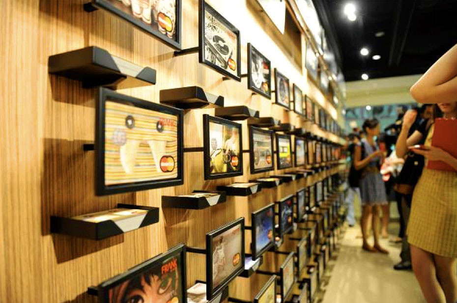
Image credit: The Financial Brand